Introducing the company
Introducing the CI
Vision and corporate culture
Our vision and cultural
principles
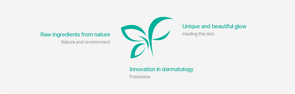
GFC Life Science captures the vitality of natural, raw materials in the form of leaves, and the CI speaks of natural raw materials, innovation in skin science, and the unique, beautiful glow of skin.
We explore natural extracts using pure ingredients and study new ways to treat the skin and promote beauty.
As for the color, turquoise works as a symbol of nature, environment, freshness, and healing the skin.
Thus, we designed the symbol and logo of GFC Life Science to convey its aspirations to share the vitality of beauty and also champion the inherent value of nature through its pure and raw ingredients.
Our CI brand tone of voice
Our CI brand tone of voice
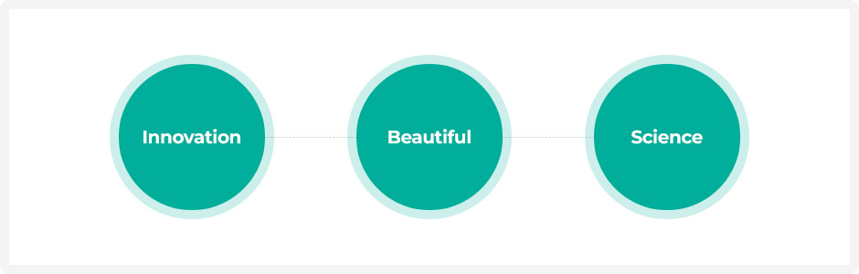
It is not what you say, it is how you say it that matters. "Revolutionizing skin science with natural ingredients to create a unique, beautiful glow." This best sums up the tone we are looking to set with our brand. Make sure to keep this message and tone in mind when introducing GFC Life Science’s CI.
CONCEPT
KEYWORD
CONCEPT
KEYWORD
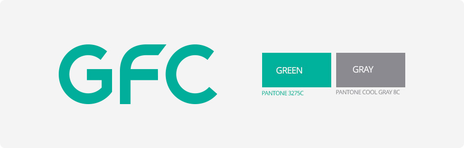
The word mark is the most important core element representing GFC as a brand. Thus, we chose a unique colorway for the word mark using Pantone colors, developed a unique logotype font for GFC, and applied a simple design that unified the angles of the English initials G.F.C., thereby improving our corporate image and brand competitiveness, and also changing to a more forward-looking design.
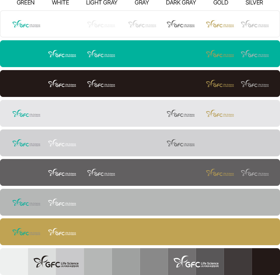
Background color rules
Background Color
To ensure legibility, the symbol mark must follow the following background color rules.
Please read understand these rules when using the symbol mark to avoid any misuse or misapplication.
Prohibited use rules
Regulations for
Prohibited Applications
The prohibited use rules provides examples of misuse of the symbol mark.
Please be aware of the examples of misuse shared here, and manage issues correctly and clearly.
*The examples in this section are intended to illustrate the most common misuse cases. Overall, any arbitrary modifications that visually harm the corporate identity of our company are prohibited.